")
")
Published in:
M. Meloun, M. Hill, J. Militký, K. Kupka: Analysis of Large and Small Samples of Biochemical and Clinical Data, Clin. Chem. Lab. Med., 39, 53 - 61 (2001).
|
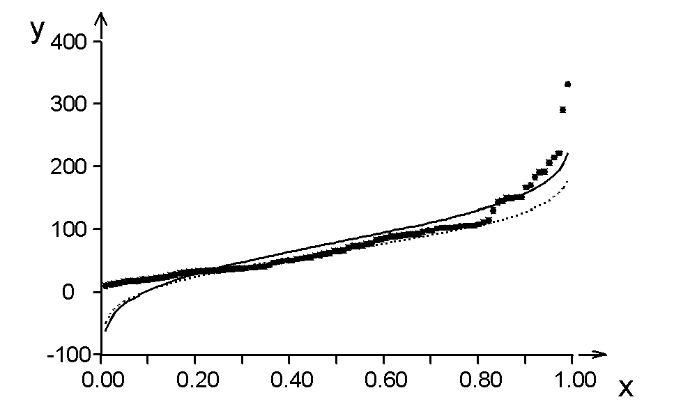
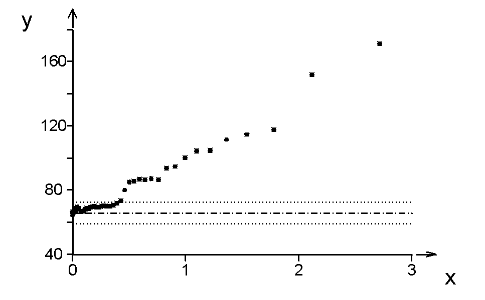
Fig. 1 The quantile plot of pregnenolone data |
|
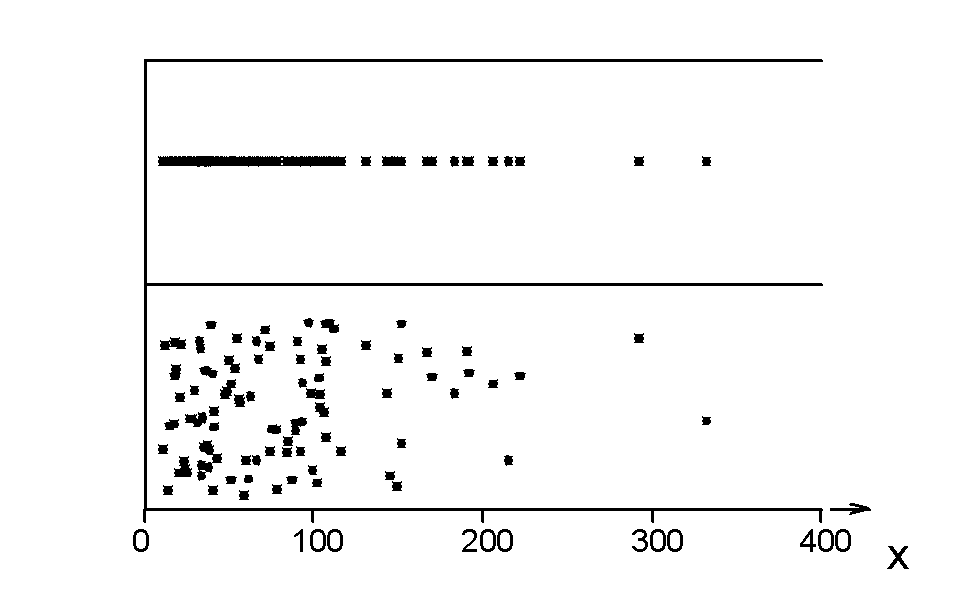
| Fig. 2 The dot and jitter dot diagram of pregnenolone data | |
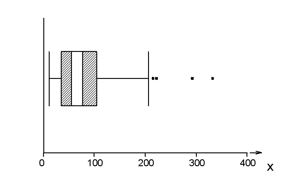
| Fig. 3 The Box-and-whisker plot of pregnenolone data | |
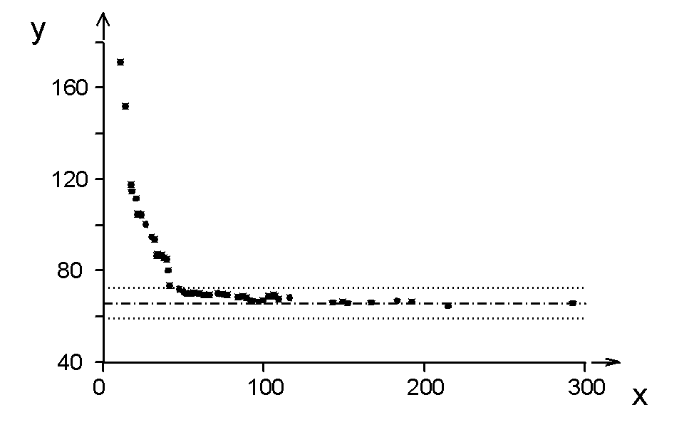
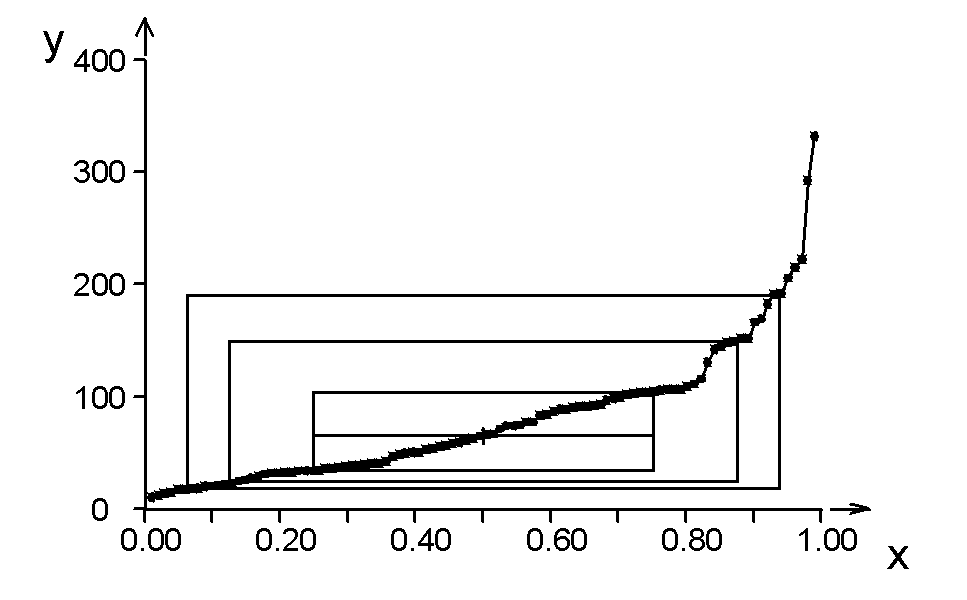
| Fig. 4 The midsum plot of pregnenolone data | |
| Fig. 5 The symmetry plot of pregnenolone data | |
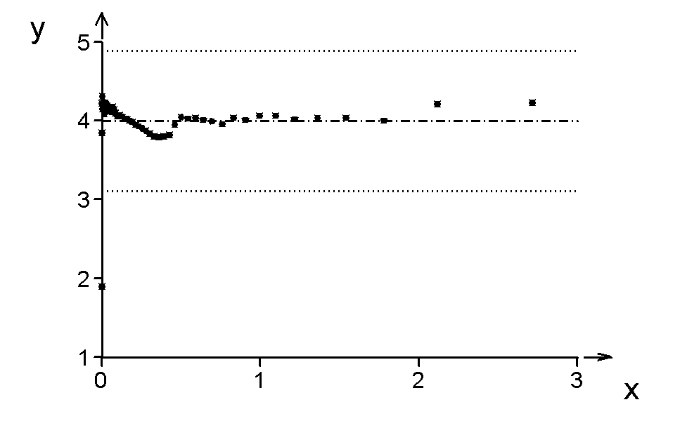
| Fig. 6 The kurtosis plot of pregnenolone data | |
| Fig. 7 The quantile-box plot of pregnenolone data | |
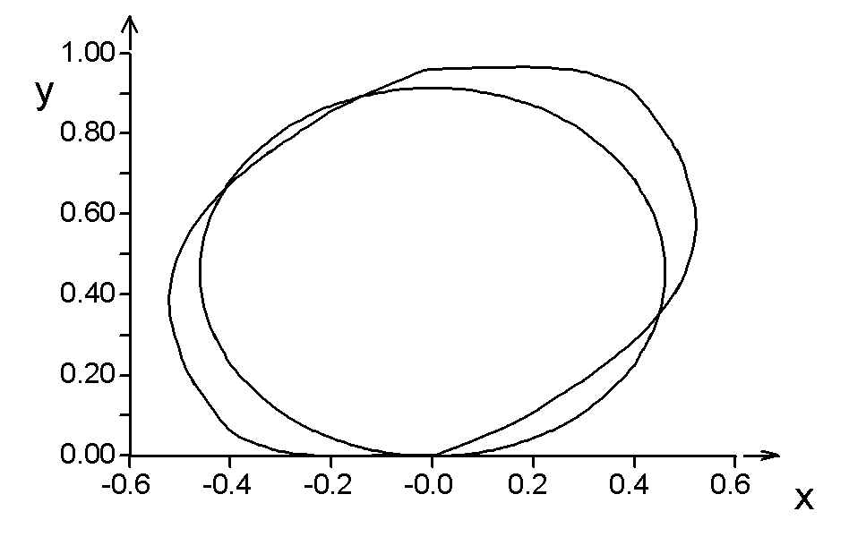
| Fig. 8 The circle plot | |
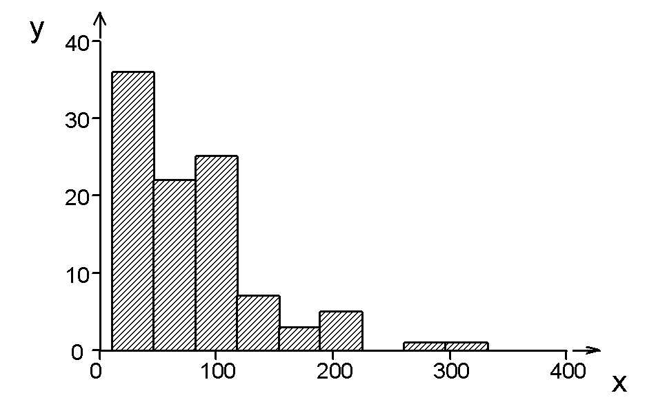
| Fig. 9 The histogram of pregnenolone data | |
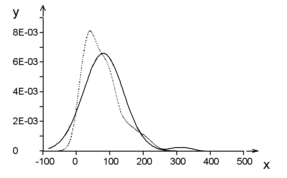
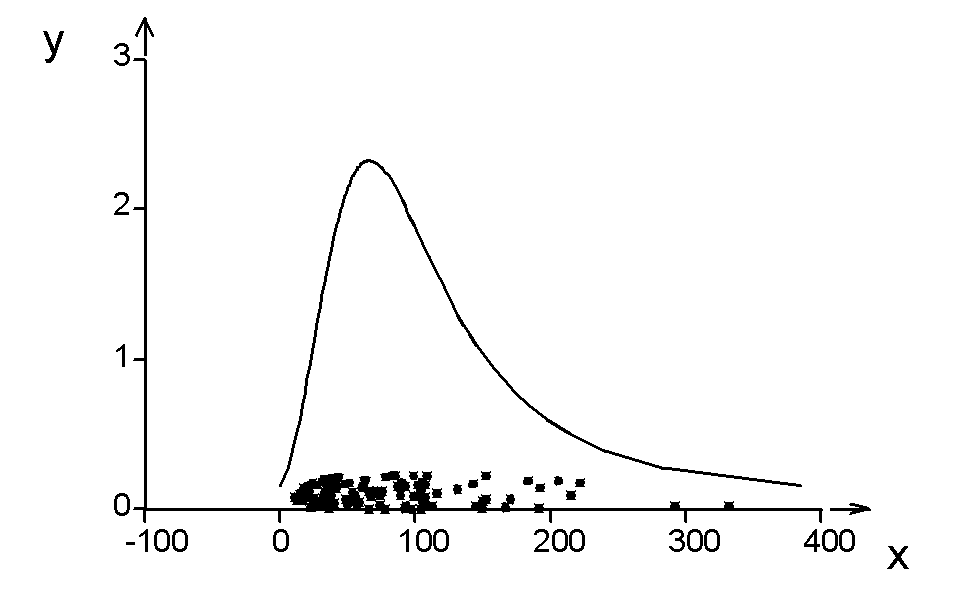
| Fig. 10 The kernel estimator of the probability density plot of pregnenolone data, showing the empirical curve (dot curve) and the normal distribution approximation (full curve) | |
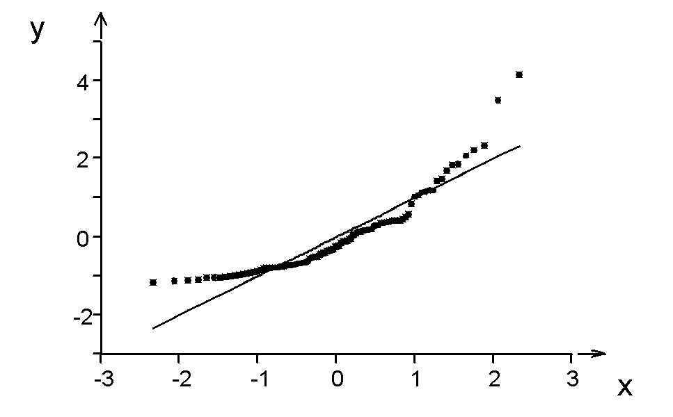
| Fig. 11 The quantile-quantile plot (for normal distribution called a rankit plot) of pregnenolone data | |
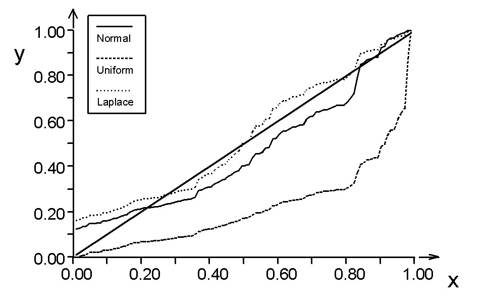
| Fig. 12 The probability-probability plot of pregnenolone data | |
| Fig. 13 The probability density plot of pregnenolone data | |
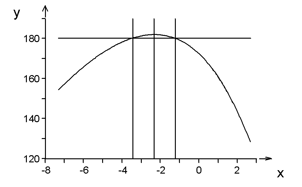
| Fig. 14 Plot of the logarithm of maximum likelihood L in dependence on the power λ for pregnenolone data, and estimation of the optimal power λmax with its lower λL and upper λU limits of the confidence interval, for the confidence level (1-α), CL1-α | |
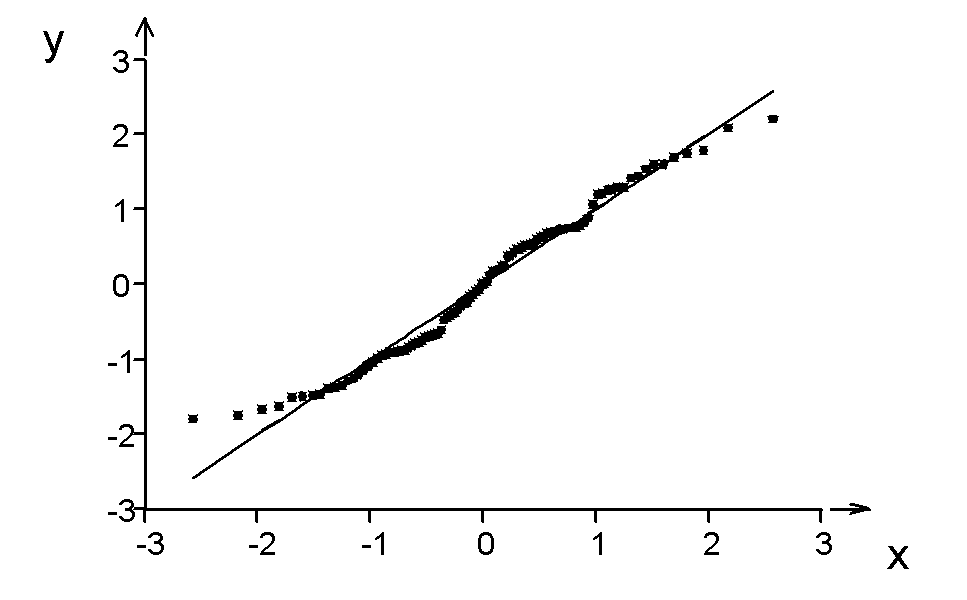
| Fig. 15 The quantile-quantile plot (for normal distribution called a rankit plot) of pregnenolone data after Box-Cox transformation |