")
")
Published in:
M. Meloun, M. Hill, J. Militký, K. Kupka: Transformation in the PC-Aided Biochemical Data Analysis, Clin. Chem. Lab. med. 38(6), 553 - 559 (2000).
Download: Data93.xls (Other biochemical data sets for the same way of a statistical data treatment are also available here)
Plots and Diagrams of Exploratory Data Analysis and Transformation:
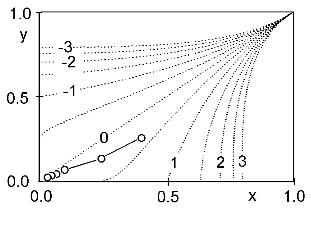
Fig. 1 Graphical estimation of λ from a Hines-Hines selection plotin the range [-3; +3]. Circles denote sample points.
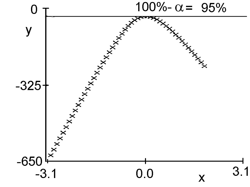
Fig. 2 The plot of the logarithm of maximum likelihood estimates λ for the statistical probability 95%.
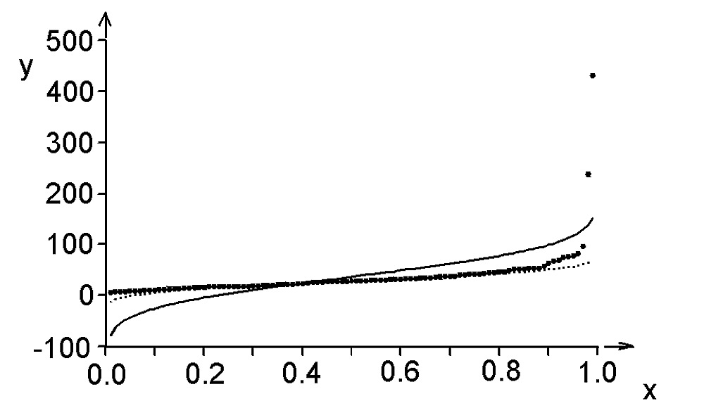
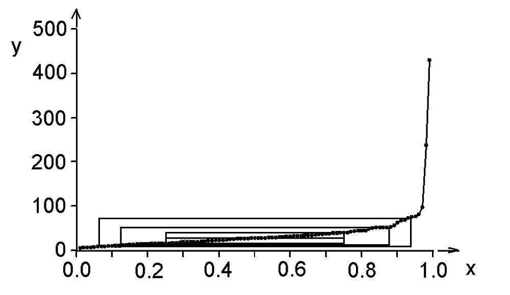
Fig. 3 The quantile plot of Preg17 data.
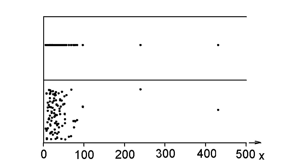
Fig. 4 The dot and jitter dot diagram of Preg17 data.
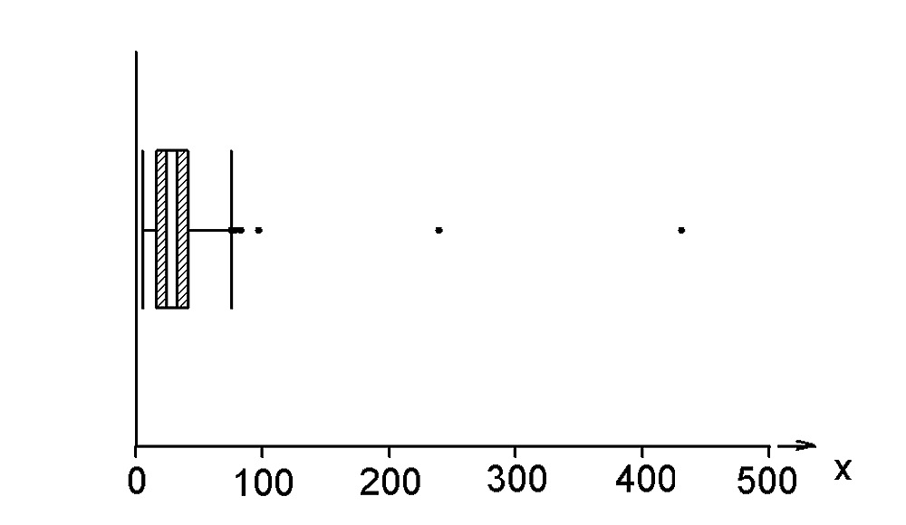
Fig. 5 The box-and-whisker plot of Preg17 data.
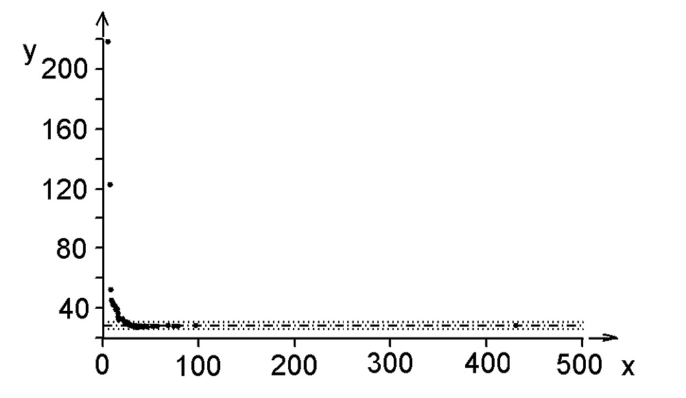
Fig. 6 The halfsum plot of Preg17 data.
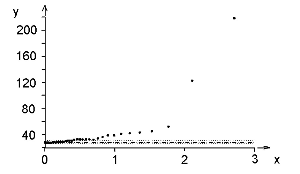
Fig. 7 The symmetry plot of Preg17 data.
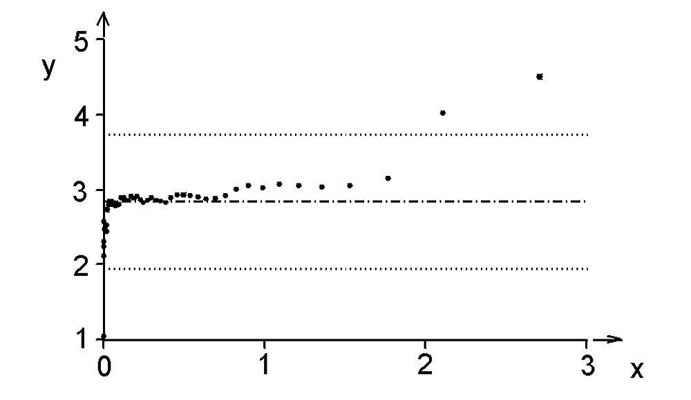
Fig. 8 The kurtosis plot of Preg17 data.
Fig. 9 The quantile-box plot of Preg17 data.
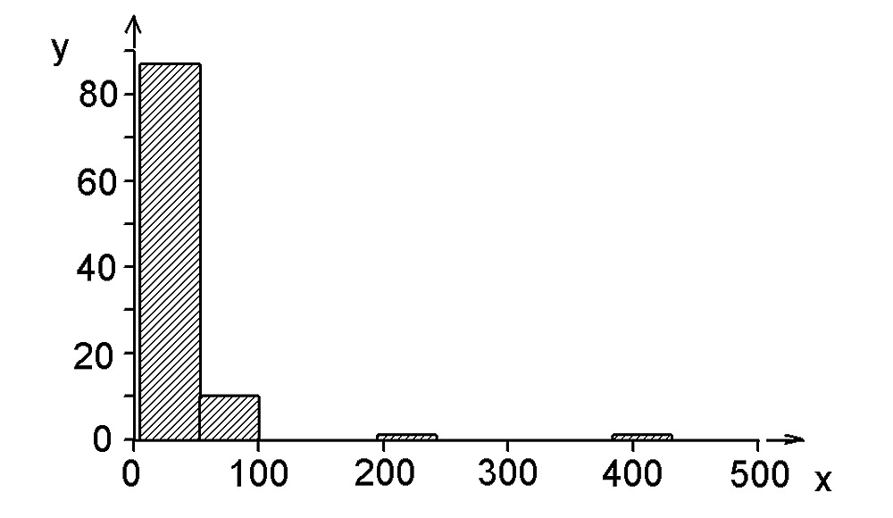
Fig. 10 The histogram of Preg17 data.
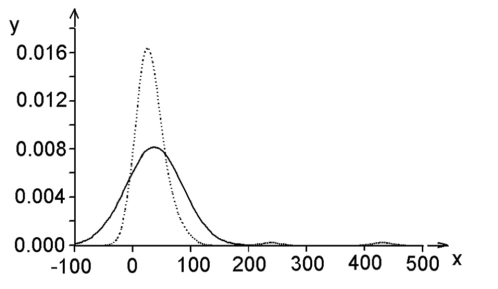
Fig. 11 The Kernel estimator of the probability density plot of Preg17 data: the empirical curve (dot curve) and the normal distribution approximation (full curve).
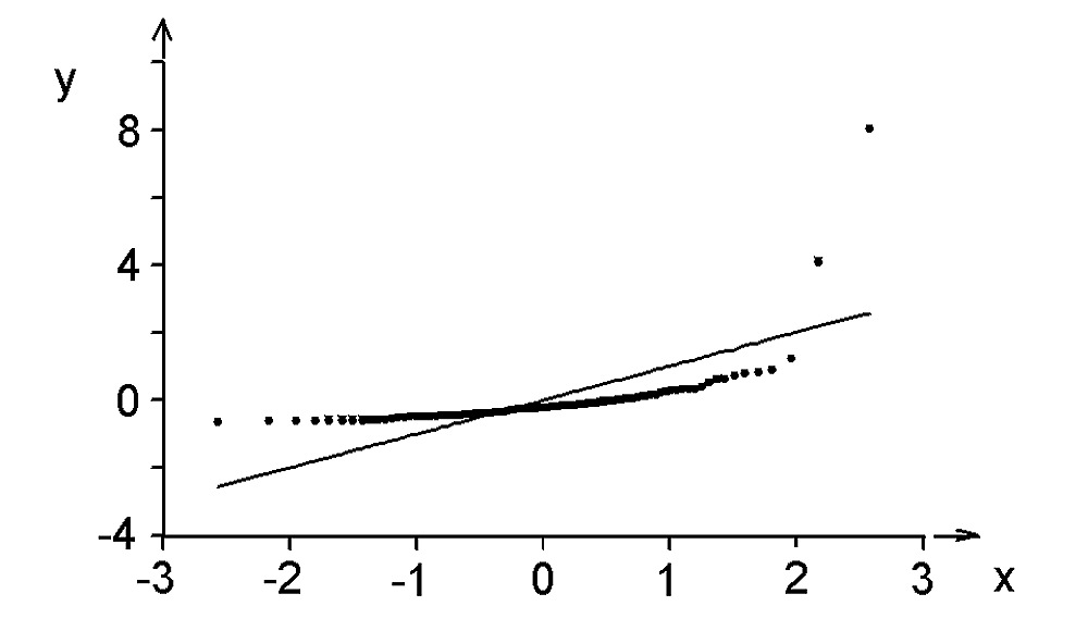
Fig. 12 The quantile-quantile plot (for normal distribution called the rankit plot) of Preg17 data.
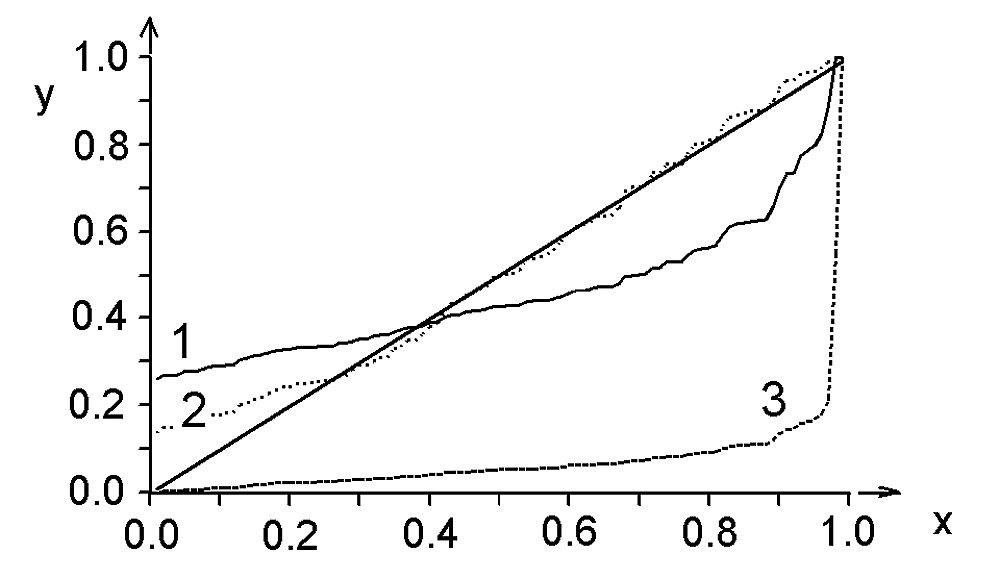
Fig. 13 Probability-probability plot of Preg17 data approximated by curve of (1) the normal distribution, (2) the Laplace distribution, and (3) the rectangular distribution.
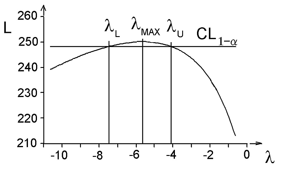
Fig. 14 The plot of the logarithm of maximum likelihood (L) in dependence on the power λ for Preg17 data and estimation of the optimal power λ max with its lower λ L and upper λ U limits of the confidence interval for the confidence level (1- α ), CL1- α .
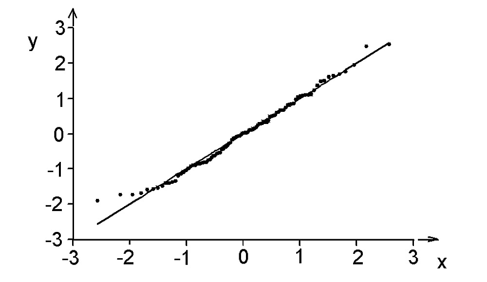
Fig. 15 The quantile-quantile plot for Preg17 data after the Box-Cox transformation. (Compare this plot before transformation on Fi 12).